A Freelancer's Brand Kit: The Mark, the Files and the Site That Wins Work
What a freelance brand actually needs, in order: a mark that survives a profile picture, four files you can send without thinking, and a portfolio site that answers the question a client is really asking.
By Bardhyl Bytyqi
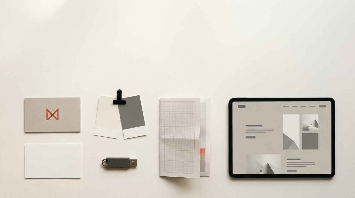
Freelance branding gets treated as either an indulgence or a weekend crisis, and it is neither. It is a short list of assets that make the difference between looking like someone between jobs and looking like a practice.
Here is the whole list, in the order it earns its keep.
1. A mark that survives a profile picture
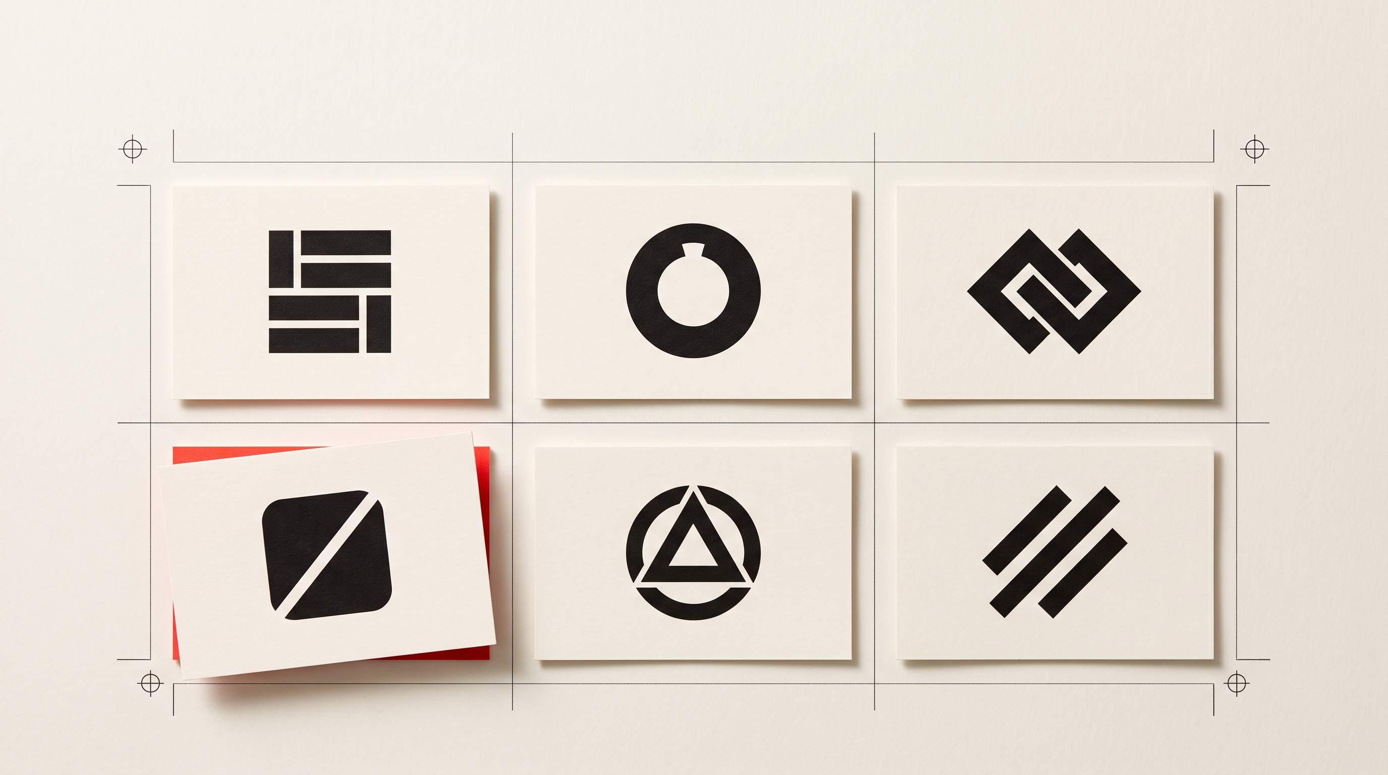
Your logo will spend most of its life at about forty pixels, in a circle, next to your name. That is the only condition it genuinely has to pass. Anything that reads at that size will read everywhere else; the reverse is not true.
For a solo practice the honest answer is usually a wordmark or a lettermark rather than an abstract symbol, because nobody knows your symbol yet and they do know your name. We laid out the comparison in wordmark, lettermark or symbol, and the size argument in the sixteen pixel test.
2. Four files, in one folder, named plainly
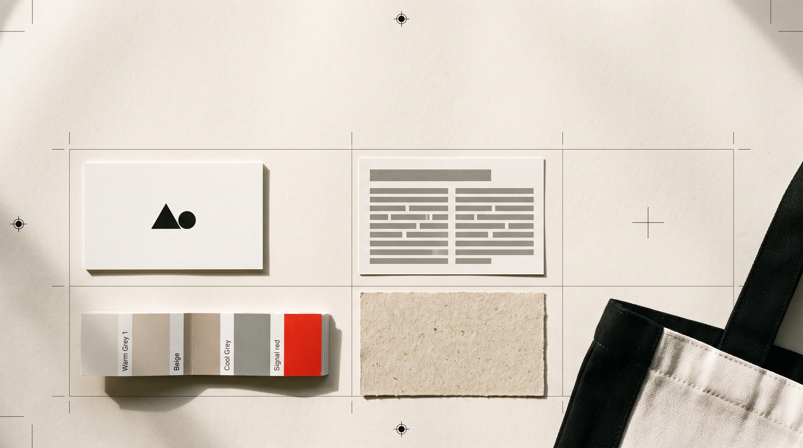
Clients and platforms ask for the same four things, endlessly: a vector for print, a large transparent PNG for everything on screen, a square crop for avatars, and a light version for dark backgrounds. Export all four the day the mark is finished. The alternative is doing it badly at eleven at night because a conference programme has a deadline. Which file goes where takes three minutes to read and saves that evening.
3. The site, which is the actual portfolio
This is where freelancers underinvest, usually in favour of a platform profile they do not control. A profile is a listing. A site is the thing a client opens after someone recommends you, and the difference in how each one is read is enormous.
It does not need to be large. Three things, done properly, beat twelve done vaguely: the work, priced or scoped clearly enough that a client knows whether they can afford you, and one obvious way to start a conversation. Modulify's portfolio website tips for students and freelancers is a good baseline, and their piece on the graphic designer portfolio site goes further into the selection problem, which is the hard part: what to leave out.
If you work in a visual field
The rules shift depending on what you sell. Photographers are judged on the first six frames and the booking path, covered in photographer website design. Editors live or die on how quickly the showreel plays, covered in turning a showreel into clients. Both are worth skimming even if neither is your trade, because they are really about the same thing: removing the steps between interest and enquiry.
4. The unglamorous three
- An email signature with the mark and a link. It goes out dozens of times a week and costs nothing.
- An invoice template carrying the same mark. Clients notice, quietly.
- A one-page rate or scope sheet you can attach without rewriting it each time.
None of these are branding in the interesting sense. All three are the reason a client describes you as organised, which is the adjective that gets you rebooked.
What clients are actually checking
Not your logo. They are checking whether you are still trading, whether you have done this specific thing before, and whether contacting you is going to be awkward. Every asset above exists to answer one of those three quickly. A mark that looks considered answers the first before a word is read, which is the entire reason it is worth doing at all.
If you are starting from nothing, do it in that order and give it one day: describe what you do in one sentence, take the mark and the files, then spend the afternoon on the site.