Wordmark, Lettermark or Symbol: Picking the Right Kind of Logo
Six kinds of logo, and an honest answer about which one a new business should choose. It is rarely the abstract symbol, and here is why.
By Bardhyl Bytyqi
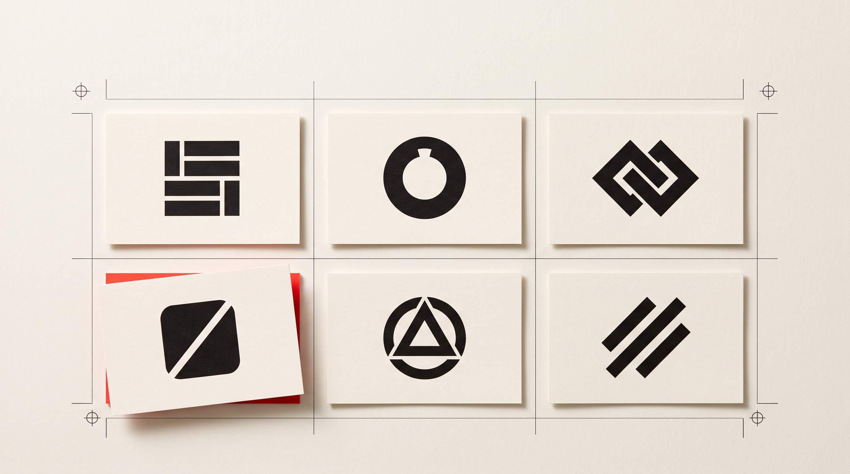
Before you judge a logo you have to know what kind of logo it is trying to be. There are six common types, each with a job it does well and a situation where it quietly fails. Knowing which one suits you removes most of the guesswork from the decision.
The six types
Wordmark
The name, set in a deliberate typeface, with nothing else. Think of the great fashion houses and most newspapers. It is the most honest option available to a new business, because every time someone sees it they read your name, which is the thing you actually need them to remember.
Works when: the name is short, distinctive and easy to say. Struggles when: the name is long, generic, or hard to spell, or when you need a square avatar.
Lettermark
The initials, treated as a shape. Useful when the full name is a mouthful, which is why so many institutions and agencies use one. The trade-off is that initials carry no meaning until people know what they stand for, so a lettermark asks for patience.
Works when: the name is three or more words, or genuinely long. Struggles when: the initials collide with a well-known organisation, which is more common than you would think.
Pictorial mark
A recognisable object, simplified: a bird, a shell, an apple. It is memorable and it survives being made small, which is a real advantage. The risk is category cliche, because the obvious object for your industry is already taken several times over.
Works when: you can find an object that is specific to your business rather than your sector. Struggles when: the object is the first one anybody would think of.
Abstract mark
A geometric form that does not depict anything, made to mean something only through use. It is flexible, it is distinctive and it belongs entirely to you. It is also the option that demands the most exposure before it says anything at all.
Works when: you have the reach to make people learn it. Struggles when: nobody has heard of you yet, which is the situation nearly every new business is in.
Mascot
A character. Warm, human and excellent at building affection, particularly in food, sport and anything aimed at families. It is also the hardest type to render small, and characters age faster than shapes do.
Works when: personality is the product. Struggles when: the brand needs to feel serious, technical or premium.
Combination mark and emblem
A symbol and the name together, either side by side (combination) or with the name locked inside the shape (emblem). The combination is the practical default: use the pair when there is room, use the symbol alone when there is not. The emblem looks superb on a badge, a bottle or a shopfront, and poorly in a narrow website header, because everything inside it shrinks at once.
How to choose in three questions
- How well known is your name? If the answer is not at all, put the name in the logo. A symbol only starts doing the work of identification after people can already connect it to you.
- How long is it? One or two short words suits a wordmark. Three or more words points to a lettermark or a symbol with the name set beside it.
- Where does it work hardest? Mostly a website header and letterhead, a horizontal lockup is fine. Mostly app icons, social avatars and packaging, you need a square-friendly symbol from day one.
The honest recommendation
For most new businesses the right answer is a combination mark: a simple symbol paired with a clean wordmark, supplied in three arrangements. The horizontal lockup for headers and documents, the stacked version for square spaces, the symbol alone for avatars and favicons.
You get the name doing the explaining while the symbol quietly accumulates recognition, and in a year or two, once people know you, you can drop the name and use the mark on its own. That path is available to you from the beginning. Starting with an abstract symbol and no name is the option that closes doors, not the one that opens them.
Test it where it will live
A logo type is easy to judge in the abstract and much harder to judge on a page. The emblem that looked confident on a bottle is the one that collapses in a narrow header, and you will not notice until the header exists. Put the candidate into a real layout early: a ready-made website template takes a minute and settles the question faster than another round of refinement.
A useful sanity check
Whichever type you land on, ask one question of the result: if a customer described your logo to a friend over the phone, would the friend be able to draw it? A wordmark passes automatically. A good symbol passes because it is one clear shape. A logo that fails that question is usually trying to be three types at once.
Once you know which type suits you, seeing it is quick. Describe your business and compare a wordmark against a combination mark side by side, in the arrangements you will actually use.