Your Logo Is Not Your Brand: The Five Things to Decide Next
A mark on its own is not an identity. These are the five decisions that make everything you produce afterwards look like it came from the same company, and they fit on one page.
By Bardhyl Bytyqi
Getting the logo done feels like finishing. It is closer to starting. The mark is one asset; what people actually experience is the accumulation of everything around it. Your invoice, your Instagram grid, the sign on the door, the way you answer an email at nine in the evening.
Consistency is what turns those separate moments into a brand, and consistency is a set of decisions, not a talent. Five of them fit on a single page, and an afternoon is enough.
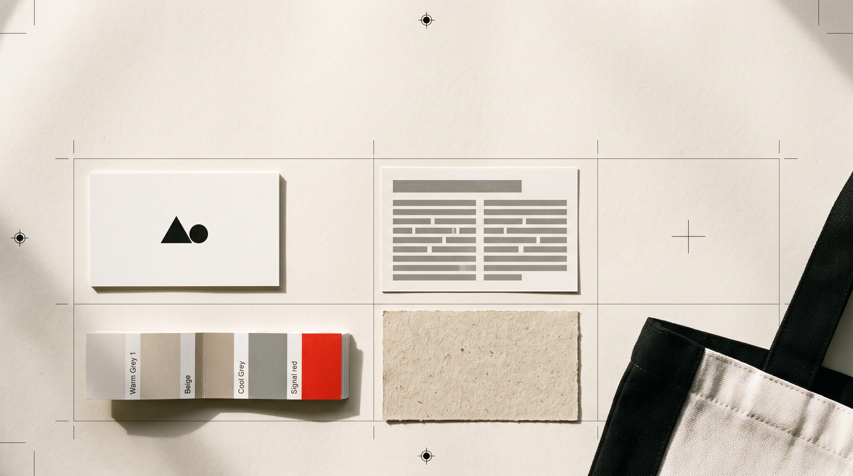
1. Colour, defined by role
Do not collect swatches. Assign jobs.
- One accent. Your logo colour, used sparingly: the main button, the thing you want clicked, the one highlight on a page. Its power comes from scarcity. Colour everything and nothing stands out.
- Two neutrals. A near-black for text and a soft off-white for backgrounds. Pure black on pure white is harsher than most people expect on a screen; easing both a little makes everything look more considered instantly.
- One quiet surface. A pale grey or a tinted version of your accent, for cards, panels and table headers.
Write the hex values down. Four values, used with discipline, look far more professional than nine used freely.
2. Two typefaces, and their sizes
One face for headings, one for body text, and that is the whole system. A third arrives with good intentions and leaves the page looking like a ransom note.
Then set the sizes. Decide on a large heading, a medium heading, a body size and a small size, and reuse those four everywhere. Most amateur-looking documents are not badly designed, they are inconsistently sized: eleven different type sizes because each one was chosen in the moment.
One more thing that costs nothing: give body text generous line spacing, around 1.6 to 1.7 times the font size, and keep headings tight. That single contrast does more for readability than any font choice.
3. Clear space and minimum size
Decide how much empty space always surrounds your logo, and never let anything intrude on it. A simple rule works: no less than the height of your logo mark on every side.
Then decide the smallest size it may ever be used at, and stop putting it below that. These two rules prevent the most common way a good logo starts to look cheap, which is being crammed into a corner beside something else.
4. One imagery direction
Pick a lane and hold it. Bright daylight photography, or moody close-ups, or flat illustration, or product shots on plain backgrounds, or no photography at all and strong typography instead. Any of those can be excellent. Mixing four of them is what makes a feed look borrowed.
If you have no budget for photography, the strongest option is often to skip it: bold type, generous white space and your accent colour will out-perform stock imagery that fights your tone. And if you do use photographs, keep the treatment identical, the same warmth, the same crop, the same level of contrast.
5. Voice, in three rules
Write down three sentences about how your business sounds. Not adjectives, rules.
We use short sentences. We never say cutting-edge or seamless. We explain the price before anyone has to ask.
Rules like that are usable by anyone who writes on your behalf, including you at the end of a long week. Adjectives like friendly and professional are not, because everyone thinks they already are both.
Put it on one page
Open a single document. Paste the logo in its three arrangements, list the four colours with their hex values, name the two typefaces and their four sizes, show the clear-space rule, write one line on imagery and the three voice rules underneath. That page is your brand guidelines. It is not a compromise for small businesses, it is the version people actually read, which makes it more useful than the fifty-page one nobody opens.
Save it next to your logo file folder and send both together whenever anyone new starts work on anything for you.
Where all five become visible
Colour, type, imagery, tone and spacing are invisible until something applies them. For most businesses the first place that happens at any scale is the website, so it is worth building the site while the five decisions are still fresh rather than months later. If that part is still outstanding, Modulify turns the same kind of description you used for the logo into a full website built with AI, and their weekend MVP playbook is a realistic account of how long that actually takes.
Consistency beats cleverness
The businesses that look established are rarely the ones with the most inventive design. They are the ones where the fifth thing you see matches the first. Same colour, same type, same tone, same spacing, over and over, until it registers as one thing.
You can decide all of it in an afternoon. If the mark itself is still missing, that is the shortest part of the job: start with one sentence about your business, take the files, then spend the rest of the afternoon on the five decisions above.