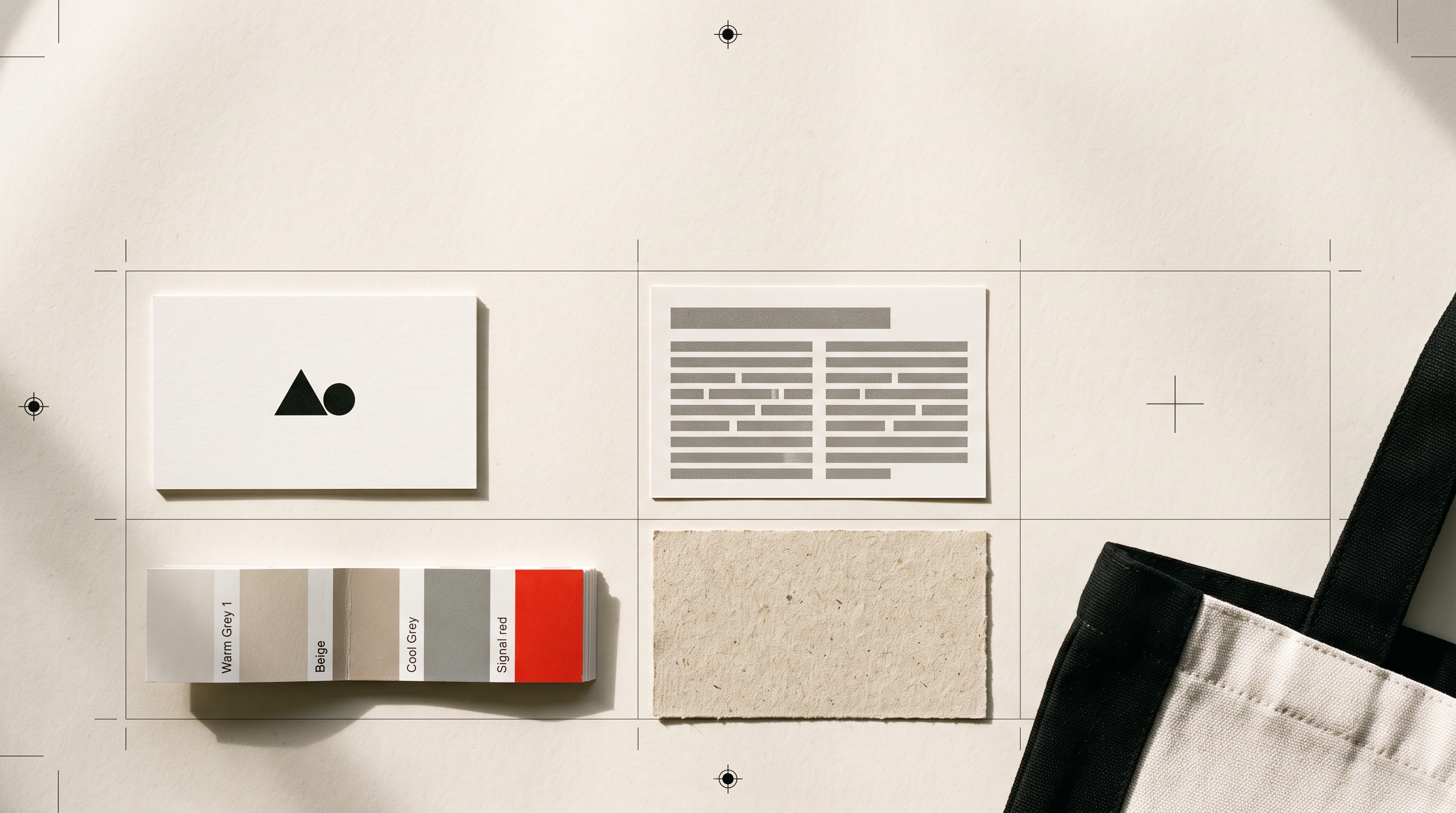
SVG, PNG and PDF: Which Logo File You Actually Need
Vector or raster, transparent or flat, print or screen. A plain-English guide to the logo files you will be asked for, what each one is good at, and which to send when.
By Bardhyl Bytyqi
Sooner or later somebody emails you asking for the logo. A printer wants it in vector. A magazine wants it high resolution. A developer wants a transparent PNG. A sign maker wants an EPS and sounds slightly annoyed that you asked what that is.
None of it is complicated once you know the one distinction that sits underneath all of it.
Vector versus raster, in one paragraph
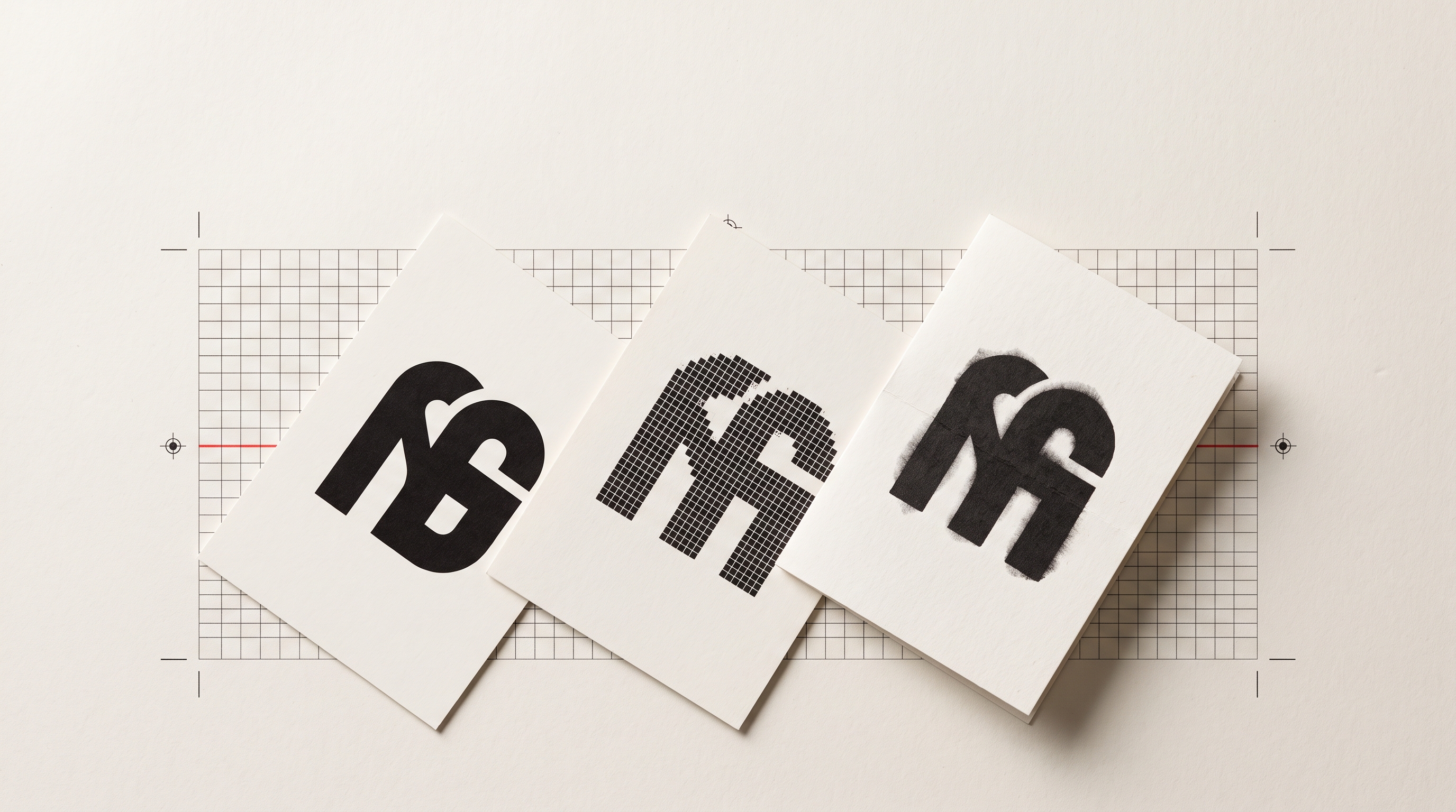
A raster file is a grid of coloured squares. Photographs are raster. Enlarge one and there are no extra squares to draw with, so the edges go soft and blocky. A vector file is a set of instructions: draw a curve from here to here, fill it with this colour. Because it is maths rather than squares, it can be printed at any size at all, from a business card to the side of a lorry, with perfectly sharp edges.
Your logo should exist as a vector first. Everything else is exported from it.
The four files that matter
SVG
Vector, and the one to use on the web. It scales to any size, stays razor sharp on high-resolution screens, and the file is usually tiny, often smaller than a photograph of a paperclip. It also supports transparency, so it sits on any background. Use it for your website header, your favicon and anywhere a developer asks for the logo. If the site those files are headed for does not exist yet, Modulify's walkthrough of going from a prompt to a live website covers the other half of the job.
PNG
Raster, with transparency. This is the everyday workhorse for anything that is not a website: social profiles, presentation slides, documents, email signatures, marketplace listings. Keep a large one, at least 2000 pixels on the long edge, and let people scale it down. Scaling down is free; scaling up is not.
PDF (or EPS)
Vector, and the format professional print uses. When a printer, a sign maker, an embroiderer or a promotional-products supplier asks for vector, this is what they mean. Send it and the conversation ends. It is also the safest thing to hand a designer you have never worked with.
JPG
Raster, and it cannot do transparency, so the logo arrives in a white box that looks obvious the moment it lands on any coloured background. It also compresses edges by guessing, which puts a faint grey halo around crisp lines. Fine for a photograph. Avoid for a logo unless a system refuses everything else.
The folder to keep
Make this once and you will never scramble again. One folder, five things:
- logo-full-colour.svg and .pdf, the primary version.
- logo-black.svg and .pdf, one solid colour, for stamps, faxes, engraving and single-ink print.
- logo-white.svg and .png, the reversed version for dark backgrounds and photographs.
- logo-2000.png, the big transparent raster for everyday use.
- icon-512.png, the mark on its own, square, for avatars and app icons.
Put a short text file beside them noting your colour values and the minimum size the logo should ever be used at. Future you, and every supplier you ever work with, will be grateful.
Decoding what people ask for
- Send us a high-res logo. They want a large PNG, or a vector if they know what to do with it. Send both.
- We need it in vector. SVG or PDF. Not a PNG dragged into a design file, which does not become vector by being moved.
- Do you have a transparent version? PNG or SVG. Not JPG, ever.
- What are your brand colours? The hex value for screens. If it is going to print, they may also want a CMYK breakdown or a Pantone reference.
- Can you send it in CMYK? Print uses four inks rather than screen light, so bright screen colours shift slightly on paper. Your printer can convert it; the important thing is that you send vector so nothing goes soft in the process.
Two rules that save the most trouble
Never enlarge a raster file. If the only copy you have is a 400 pixel PNG pulled off an old website, blowing it up to poster size will look exactly as rough as it sounds. Redraw it as vector instead.
Keep the original. The editable source, and the vector files, belong in the same place as your other business records. Logos most often get lost when the person who made them changes agency, laptop or email address.
Getting the whole set at once
The point of holding a proper vector original is that every other file is five seconds of exporting away. If you are starting from scratch, make your mark and take away the print-ready vector alongside the everyday PNGs, so the next time somebody asks for it in vector you can simply attach it and get on with your day.
Once the folder is complete, the only question left is where each file goes. Header, favicon, social preview and email signature all want a different version, and the quickest way to check them is to drop them into a real page rather than a mockup: the free Modulify website templates are built to have your own branding swapped straight in.