
Inspiration Without Imitation: How to Use a Logo You Love as a Reference
Everyone has a logo they wish was theirs. Here is how to borrow the right things from it, the weight, the structure, the mood, and leave the parts that belong to someone else.
By Bardhyl Bytyqi
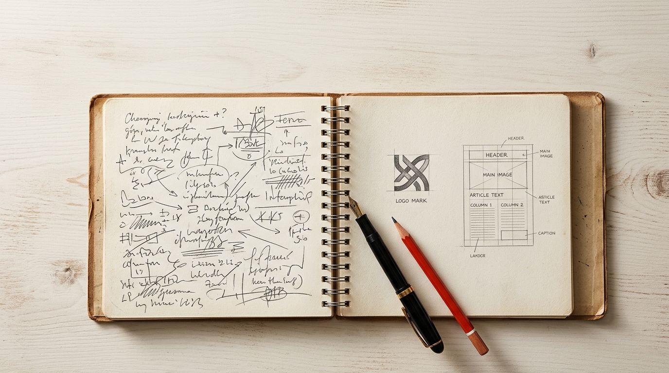
Ask a business owner what they want their logo to feel like and you will get adjectives: modern, clean, friendly, premium. Ask them to show you a logo they love and you will learn more in ten seconds than in ten minutes of adjectives. A reference image is the fastest brief there is.
It is also easy to misuse. The goal is a logo that feels like the thing you admire, not one that could be mistaken for it. That comes down to knowing which parts of a reference are fair to borrow.
What a reference is good for
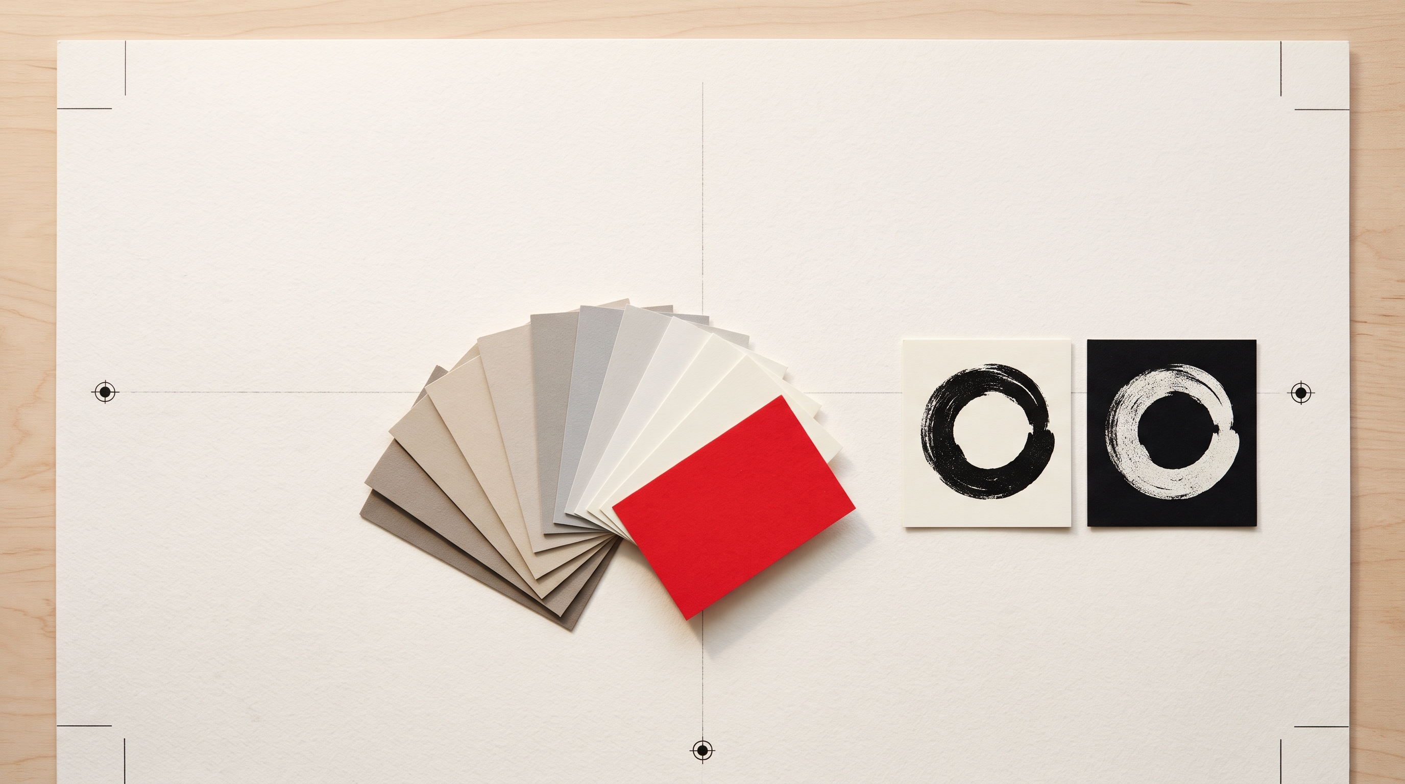
Words like modern mean something different to everyone. An image settles the argument. It shows how heavy the lines should be, how much space surrounds the mark, whether the letters are tight or airy, whether the feel is crafted or engineered. Designers have always worked from mood boards for exactly this reason.
Borrow the qualities, not the shape
Think of a reference as a list of qualities you can take separately:
- Weight. Bold and chunky, or fine and delicate.
- Structure. Symbol beside the name, symbol above it, name on its own, name inside a badge.
- Geometry. Built from circles and straight lines, or drawn by hand.
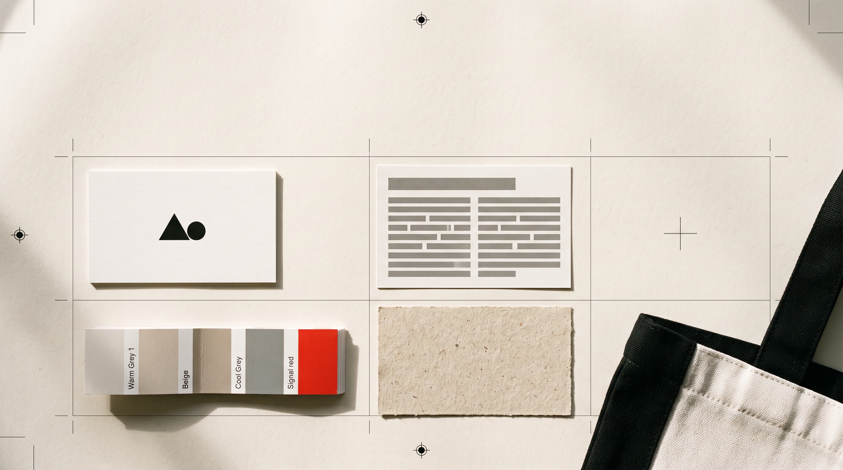
- Colour approach. One colour, black with one accent, or a full palette.
- Era and mood. Vintage print shop, Swiss poster, tech start-up, children's book.
All of these are fair game. Nobody owns bold lines or a black and red palette. What you should leave behind is the specific thing that makes the original recognisable: its exact symbol, its lettering, its distinctive combination of shape and colour, especially if it belongs to a business in your own market.
Say what you like about it
The most useful thing you can add to a reference is a sentence explaining why you chose it. Compare two briefs:
- A bakery called Crumb, like this logo.
- A bakery called Crumb. I like the heavy, rounded letters and the single warm colour in this logo, but I want our own symbol, maybe something to do with bread.
The first invites a copy. The second gets you the feel without the shape, and gives the designer, or the AI, something specific to aim for.
Use more than one, and not only logos
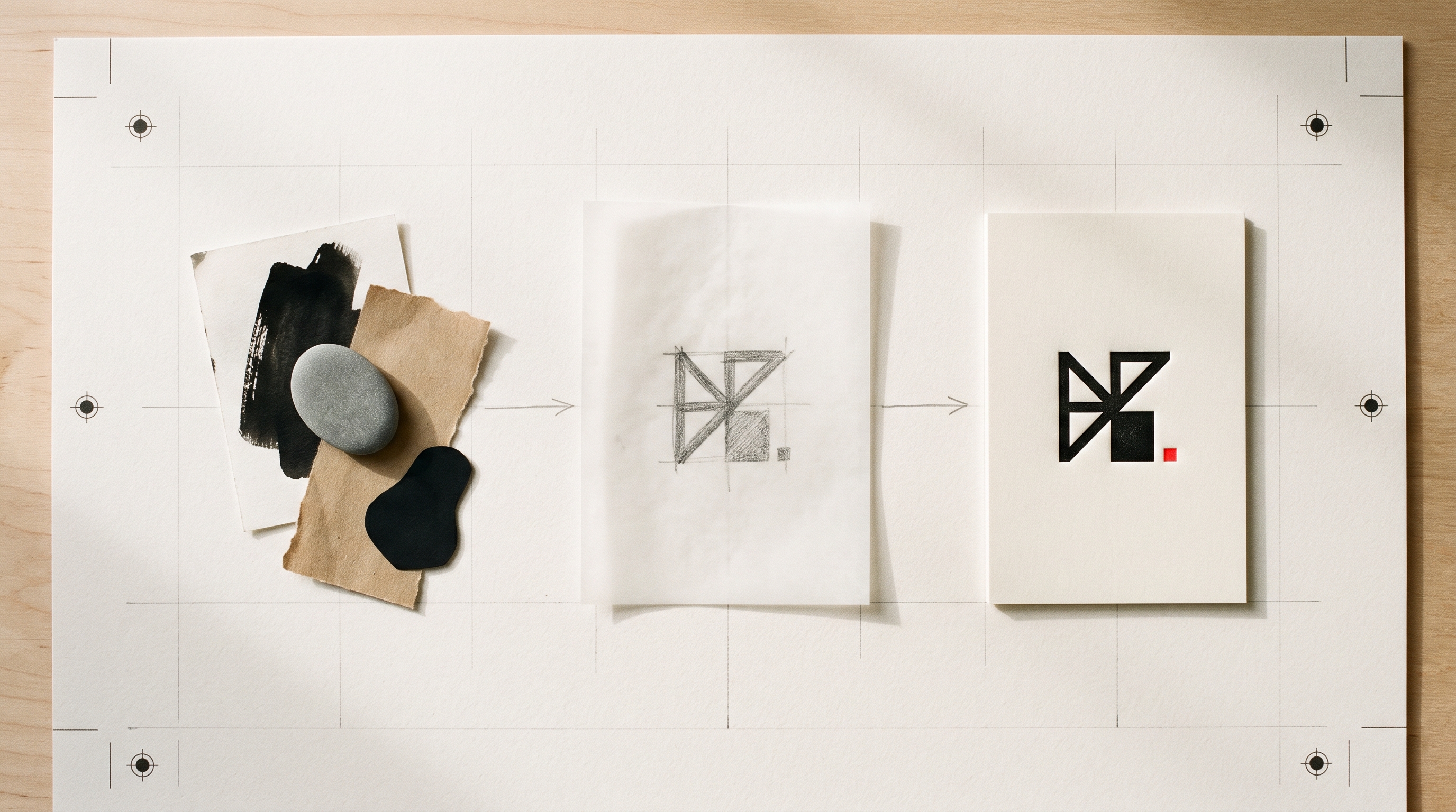
Two or three references pull the result towards what they share rather than towards any single one, which is the natural route to something original. They do not all need to be logos either. A shop sign you photographed on holiday, a piece of packaging, a texture, a poster or even a pebble with the right shape can say more about the feel you want than another company's mark.
How to do it here
You can now attach an image straight to your brief. On the homepage, write your one-sentence description, then press the Image button, drag a picture onto the box or paste one in. Use the sentence to say what you want taken from it: the weight, the layout, the colours or just the mood. The image travels with the brief and every concept is designed with it in view, while the instructions keep the result original rather than a copy.
Check the result against the reference
When the concepts arrive, put each one next to your reference and ask whether a stranger could think they came from the same company. If the answer is yes, keep the qualities you liked and push the shape further away. Then run the same short search covered in how to check your logo is safe to use, because an original-looking mark is only half the job; it also needs to be clear of everything else in your market.
The same habit of describing what you like, instead of pointing at something and saying that one, works for the rest of the brand too. Modulify's piece on why the prompt is the new design brief applies it to building a whole website.