
How to Choose Brand Colours for a New Business
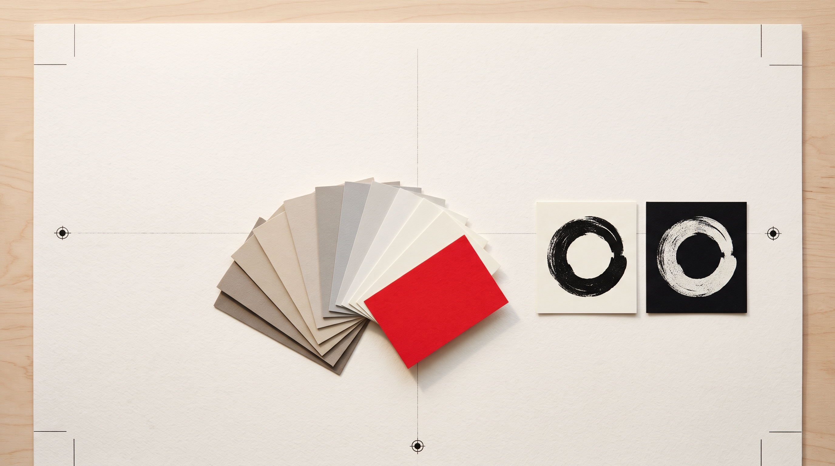
Forget the colour psychology charts. A new brand needs one dark, one light and one accent, chosen for contrast and for the places they will actually be used.
By Bardhyl Bytyqi
Colour is the decision new business owners argue about longest and get wrong in the most predictable way. Not by picking the wrong colour, but by picking too many. A palette of six equally important colours looks lively on a mood board and chaotic on a website, a shop front and an invoice, because nothing tells the eye where to look.
The good news is that a working brand palette is small, and choosing it is mostly a matter of answering practical questions in the right order.
Ignore the colour psychology chart
You have probably seen the chart: blue means trust, green means growth, red means energy. It is not useless, but it is not a decision either. Blue is used by banks, airlines, social networks and toothpaste. If colours carried fixed meanings, those brands would be interchangeable.
What actually shapes how a colour reads is context. Look at the five businesses a customer is most likely to compare you with. If every one of them is navy and white, navy will make you look established and invisible at the same time. Sometimes that is exactly right, a law firm does not need to surprise anyone. Often it is a missed chance to be the one that is easy to remember.
Start with three colours, not six
Nearly every identity that holds together uses the same structure:
- A dark for text and the logo itself. Usually a near black, a deep navy or a dark brown. This colour does most of the work.
- A light for backgrounds. Pure white, an off white, a pale stone. It sets the temperature of everything.
- One accent that appears rarely and means something: the button you want pressed, a price, a highlight.
You can add a mid grey for supporting text later. You almost never need a second accent, and when you think you do, a lighter or darker step of the first one usually solves it.
Pick the accent last, and give it a job
The accent is the colour people will associate with you, so it is tempting to choose it first. Choose it last instead, once the dark and the light are settled, and decide what it is for. An accent used everywhere stops being an accent. Used only on the most important action on each page, it trains customers to look for it.
A useful test: if you removed the accent from your website entirely, would anything become harder to use? If not, it is decoration, and decoration is the first thing to look dated.
Check the contrast before you fall in love
A pale yellow accent on a white background looks fresh in a mock-up and disappears on a phone in sunlight. Before you commit, check that your dark on your light is comfortable to read for long passages, and that any text you plan to put on your accent colour is still legible. Accessibility guidelines suggest a contrast ratio of at least 4.5 to 1 for body text, and free online contrast checkers will tell you in seconds whether a pair passes.
Check the accent on a dark background too. Plenty of colours that look strong on white turn muddy on black, and you will need both the day you make a dark social banner.
Make sure the logo survives without colour
Your logo will be printed in one colour more often than you expect: on a receipt, a rubber stamp, an engraved sign, an embroidered polo shirt. If the mark only works because of the colour, it does not work. Turn it solid black and solid white before you finalise anything. The 16-pixel test covers this step and the other checks worth running on a new mark.
Write the codes down once
Most palette problems a year later come from someone guessing. Write every colour down in one place with the values you will be asked for:
- HEX, the six-character code for websites and apps.
- RGB, for screen work in design tools.
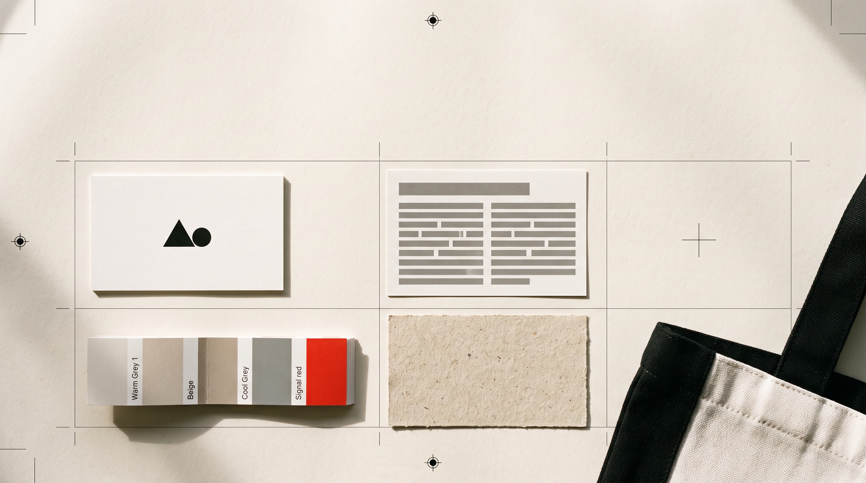
- CMYK, for anything printed. Screen colours often shift on paper, so ask your printer for a proof the first time.
Keep that list next to your logo files. The person building your website, the printer making your cards and the friend designing your first flyer should all be working from the same page.
Try it on the real thing
A palette is easier to judge on a logo than on a row of swatches. When you describe your business in one sentence, the style step lets you either pick your own colours or leave the choice to the designer, so you can compare a few directions side by side before deciding.
Once the colours are settled, the quickest way to see them at full scale is on a page. A ready-made website template takes three colours well, and shows within minutes whether your accent is doing its job.