The 16-Pixel Test: Why the Simplest Logos Win
Most logos are designed at 1200 pixels and used at 32. Here is the five-minute test that tells you whether yours survives the shrink, and the four things to cut when it does not.
By Bardhyl Bytyqi
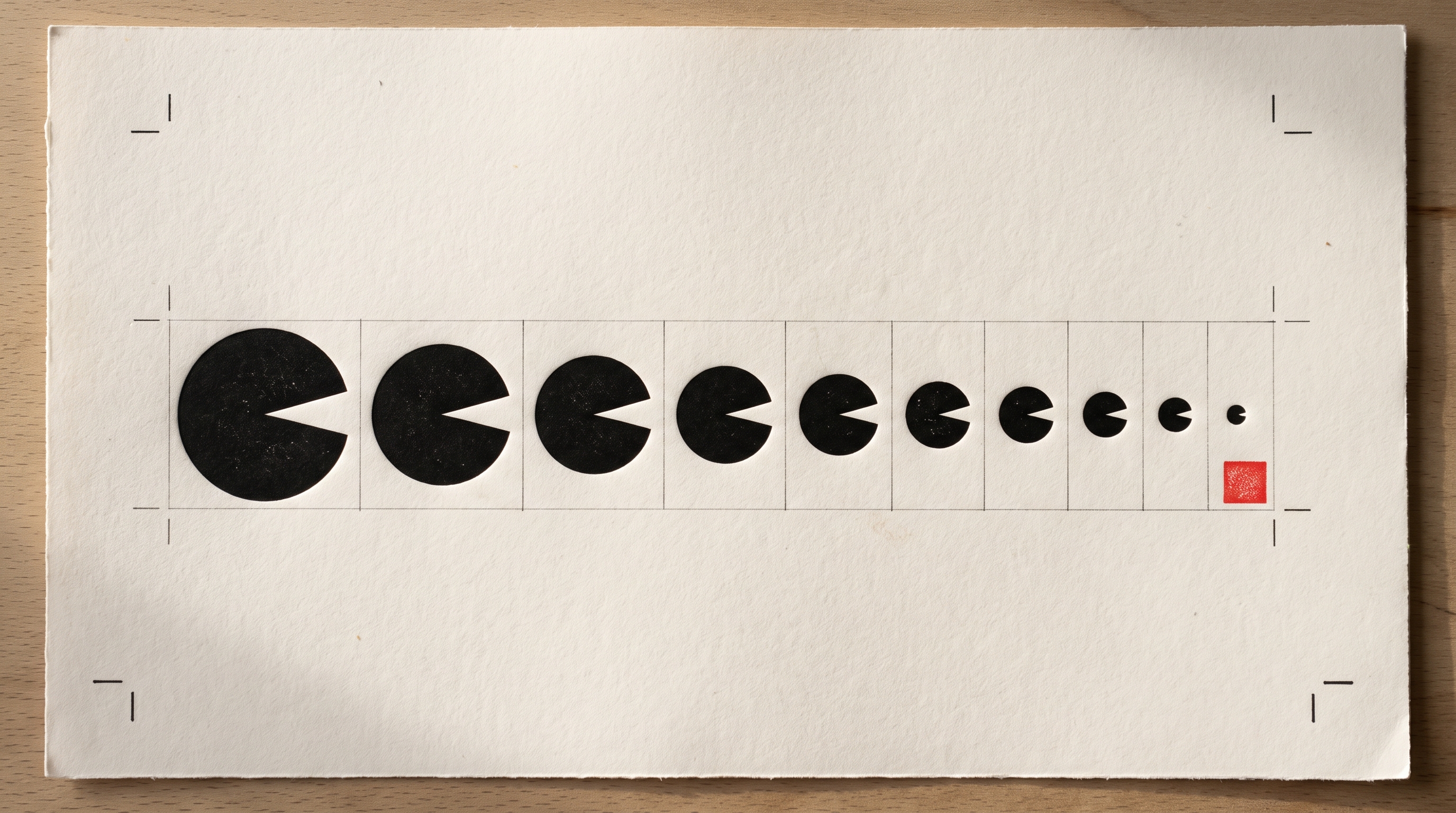
Your logo will spend most of its life small. It sits in a browser tab at sixteen pixels wide. It sits on a phone home screen, in an email signature, in the corner of an invoice, on a business card handed over in bad lighting, stitched into a shirt by a machine that cannot render anything thinner than a millimetre. The big, beautiful version you fell in love with is the version almost nobody sees.
This is why the marks you admire look almost too simple the first time you meet them. They were not designed to impress at full size. They were designed to survive the shrink.
The five-minute test
You do not need a design background to run this. You need your logo and a few minutes.
- Shrink it to sixteen pixels. Resize the image until it is the size of a browser favicon, then look at it. Can you still tell what it is, or has it become a grey blob?
- Strip the colour. Turn it pure black on white, then white on black. A mark that only reads because of its gradient stops working the moment somebody photocopies it, stamps it, engraves it or prints it on a receipt.
- Squint at it. Stand two metres back and half close your eyes. You should still see one confident shape, not a smudge.
- Draw it from memory. Look for three seconds, cover it, sketch it. If you cannot reproduce your own logo, a customer who saw it once certainly cannot.
Most logos fail on step one or step two. That is useful information rather than a disaster, because almost every fix is subtractive.
Why detail disappears
A sixteen pixel square contains 256 pixels in total. That is the entire budget for your idea. Every extra element inside the mark competes for those pixels, and the screen settles the argument by blending them into a single muddy tone.
Print has the same ceiling in a different form. Ink spreads slightly on paper, embroidery thread has a minimum thickness, a vinyl cutter has a minimum blade radius, etched metal has a minimum groove. In every one of those processes the first thing to vanish is the fine detail somebody was proudest of.
The four things to cut first
Gradients and glow
A gradient is a decision the eye cannot resolve at small sizes, so it averages out into a flat, slightly dirty colour. Worse, it forces every future use into full colour: no single-ink stamp, no laser engraving, no embroidery, no watermark. Pick the strongest single colour in the gradient and use that instead. If the mark feels weaker afterwards, the gradient was doing the work the shape should have been doing.
Hairline strokes
Thin, elegant lines are the first casualty of scale. Below a certain width they either disappear entirely or, on a screen that cannot render half a pixel, thicken unevenly and make the mark look wobbly. Aim for strokes that stay visibly solid when the whole logo is the height of a lowercase letter.
Element count
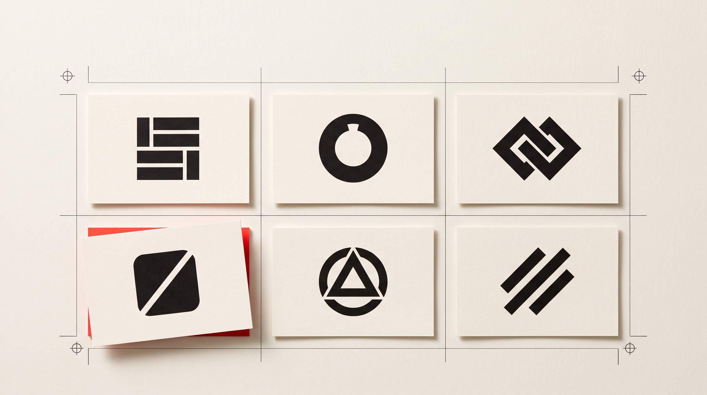
Count the distinct parts of your mark: shapes, letters, lines, dots, containers. Four or fewer is comfortable. Seven is a warning. Anything above ten will only ever work on a screen at full size. The usual culprit is a scene rather than a symbol: a mountain, a sun, a river and a tree all crammed into one circle. Choose the one that carries the meaning and let the rest go.
The tagline lockup
Small text set underneath a mark is unreadable at anything under about 200 pixels wide, and it drags the symbol upward so the whole thing looks top-heavy in a square avatar. Keep the tagline for the website header and the presentation deck. Everywhere else, use the mark alone.
Build the small version on purpose
Professional identities rarely use one file everywhere. They use a small family that shares one idea:
- The full lockup, symbol and name side by side, for website headers, letterheads and signage.
- The stacked version, symbol above name, for square spaces and merchandise.
- The mark alone, for favicons, app icons, profile pictures and anywhere below about 100 pixels.
Deciding this once means you never have to squeeze a horizontal logo into a round avatar again, which is where most brands quietly start looking amateur.
The full lockup gets judged in a website header more often than anywhere else, so it is worth checking against a real layout rather than a white artboard. If there is no site to test it in yet, an AI website builder like Modulify will put a working page around the mark in a few minutes, which is quicker than mocking one up.
What good looks like
The marks that pass this test tend to share three qualities. They have one clear silhouette that stays readable when filled in solid black. They use one accent colour with real contrast against both white and dark backgrounds. And they carry a single idea rather than a summary of everything the business does.
That last point is the hard one. A logo is not a description of your company. It is a label your customer learns to recognise. The apple does not explain the computer, and the tick does not explain the running shoe. They just became unmistakable through repetition, which only works if the shape is simple enough to be repeated accurately.
Run the test today
Open your logo, drop the size to sixteen pixels, turn it black and be honest about what you see. If it holds, you have something worth putting on everything. If it does not, you now know exactly which parts to remove.
If you would rather start again, you can describe your business in one sentence and see a set of marks built around a single clear shape, then download the version you want in the formats you will actually be asked for.
The same discipline is worth carrying into the page around it. Modulify's guide to going from a prompt to a live website applies the same one-sentence thinking to a whole site.