Your Logo Is Done. Here Is What the First Week Looks Like.
A finished mark is the start of a short list, not the end of one. Here is where the logo goes first, in what order, and how to have a real site around it before the week is out.
By Bardhyl Bytyqi
The mark is finished. It is sitting in a downloads folder with four files beside it, and that is where a surprising number of logos stay for months. The gap is not laziness. It is that nobody tells you what the next step actually is.
Here is the order that works, spread across about five days of ordinary work, none of which needs a designer.
Day one: the places people already look
Start with the accounts that already exist and already have an empty grey circle where a logo should be. Social profiles, your email signature, the invoice template, the deck you send to prospects. Together these take under an hour, and they are the ones being seen right now, today, by people deciding whether you are a real business.
Use the square version of the mark anywhere the space is round or cropped. If you only have the horizontal lockup, it gets shrunk to fit the width and ends up illegible, which is the most common way a good logo comes to look bad. The reasoning is in the sixteen pixel test.
Day two: put the file folder in order
Move the vector original, the large transparent PNG and the print-ready file into one place that is not a laptop desktop. Name them plainly. Within the first month a printer, a marketplace, a journalist or a developer will ask you for one of them, and the difference between five seconds and forty minutes is whether this folder exists. Our guide to which logo file to send and when covers what each one is actually for.
Days three to five: the site
This is the part people postpone, usually because the last time they looked at it, building a website meant either a month inside a page builder or a quote with a comma in it. That is no longer the situation. Describing the business in a few plain sentences now returns a working, hosted page, which is close enough to what just happened with the logo that the process will feel familiar rather than daunting.
If you want to see the whole path before committing an afternoon to it, Modulify's guide to going from a prompt to a live website is an honest walkthrough, including the parts that need a second pass. The builder itself is Modulify, from the same team as this logo maker.
Have two things ready before you start, because they are the first questions you will be asked: what the business does in one sentence, and who it is for. Both are already written if you briefed the logo properly.
The header is the real test
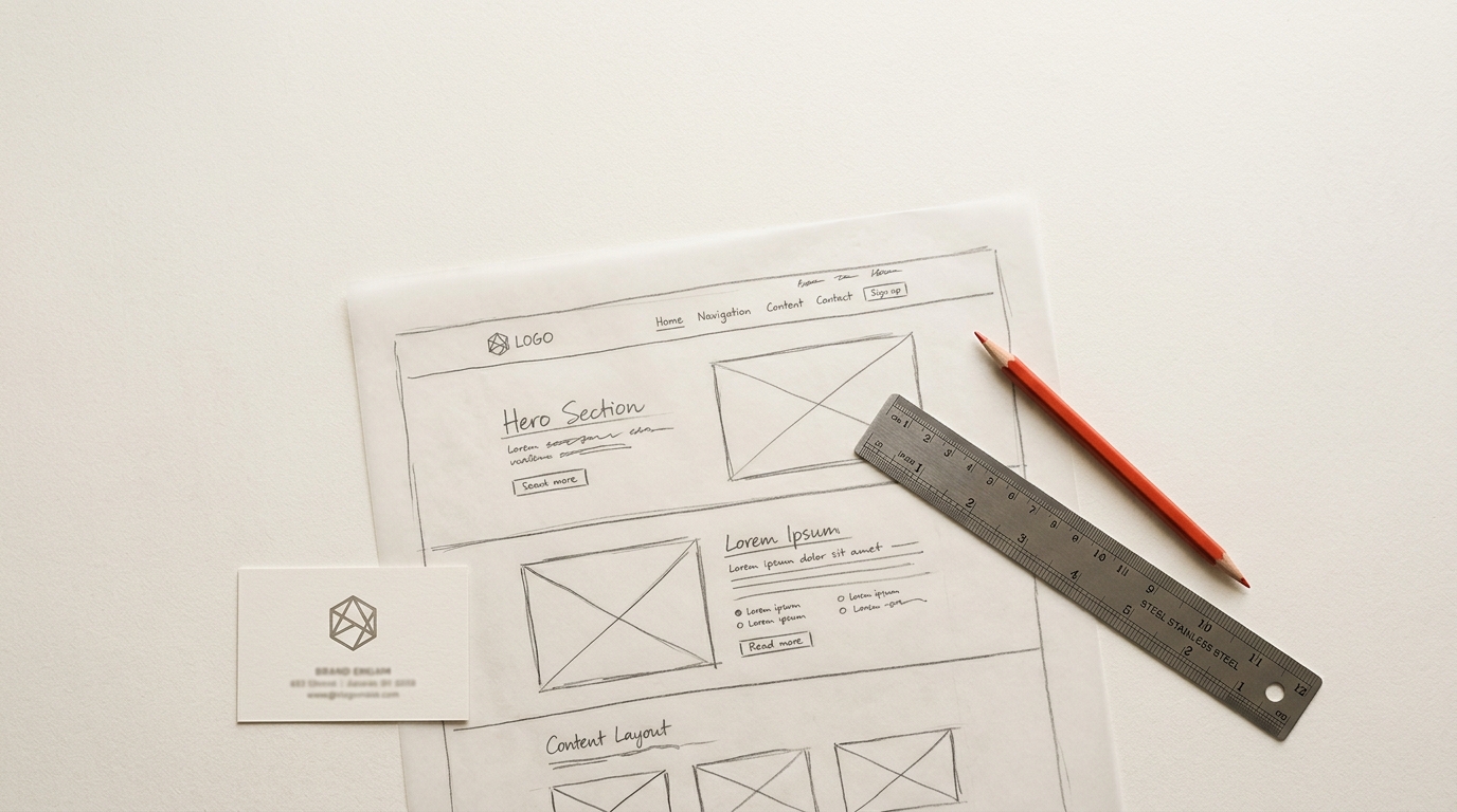
A logo looks convincing on a white artboard and tells you nothing there. It only reveals its problems in a header, at around forty pixels tall, next to four navigation links and a button. That is where you find out that the tagline is unreadable, that the symbol is too detailed, or that the whole lockup is too wide to sit alongside a menu on a phone.
Build the header early for that reason, not last. If it survives, everything else will.
The two small files everyone forgets
- The favicon. The sixteen-pixel square in the browser tab. It should be the symbol alone, never the full lockup, and never a shrunken screenshot of one.
- The social preview image. The picture that appears when someone pastes your link into a message or a post. Without one, your link shows as a bare grey rectangle, which quietly undoes the work of everything above.
What can wait
Business cards, merchandise, signage, a full brand guideline document, a second colourway. None of these are urgent, and several of them are decisions you will make better in three months than you can this week. Ship the profiles, the folder and the site. Revisit the rest when something specific requires them.
If the mark itself is still missing, that part is the shortest of all: describe your business in one sentence, take the files, and start the week above on Monday.